So, this week we had Mathieu Jacomy from Sciences-Po, Paris to visit us and he gave a really great Workshop on Gephi and the various scientometrics tools made by the Médialab, such as ScienceScape and Table 2 Net. With these tools, you have infinitely many ways to combine data to do network analysis. You just need category data formatted in a csv file to be able to map away!
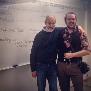
Especially the second part was great, where Mathieu changed the direction of the workshop to a problem that I had ventilated, namely to create dynamic maps that could be animated on the screen. You can see this below, but first some preliminaries based on a static visualisation. Here’s a photo of Mathieu and our benefactor and workshop participant, professor Sándor Darányi. This workshop was organized by my dear colleague Nasrine Olson in association with the Strategic Research Program in Data Science.
Static view
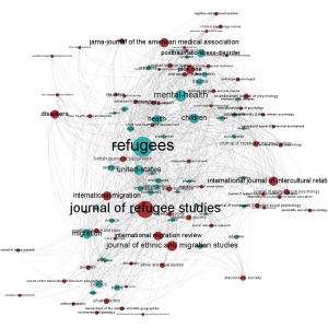
 Here is a static image containing keywords related to the journal titles in which the articles having the keywords were published in. The data set covers the years 1956 to 2014 and publication data is harvested from Web of Science, see below for a thorough description of the data. In all 8500 papers were browsed for keywords and for clarity, only keywords and journal tiles occurring more than 50 times (111 nodes, 986 edges) are shown in the visualisation to the right (click to enlarge).
In the workshop we worked with metric data from Web of Science. In my case, I had downloaded article entries pertaining to refugee studies which is the wider area of a pre study for a research project I am involved in right now. The project, led by our new professor at University of Borås, Annemaree Lloyd, is about gaining knowledge information needs of refugees as they enter a new country/continent.
In this set about 8.500 papers/reviews in the social sciences (psychiatry and public health excluded) are searched for keywords and journal tiles using the Medialab tools.
The journal tiles are red in the visualisation above, and the keywords pertaining to articles in the respective journals are found in turquoise.
Dynamic view
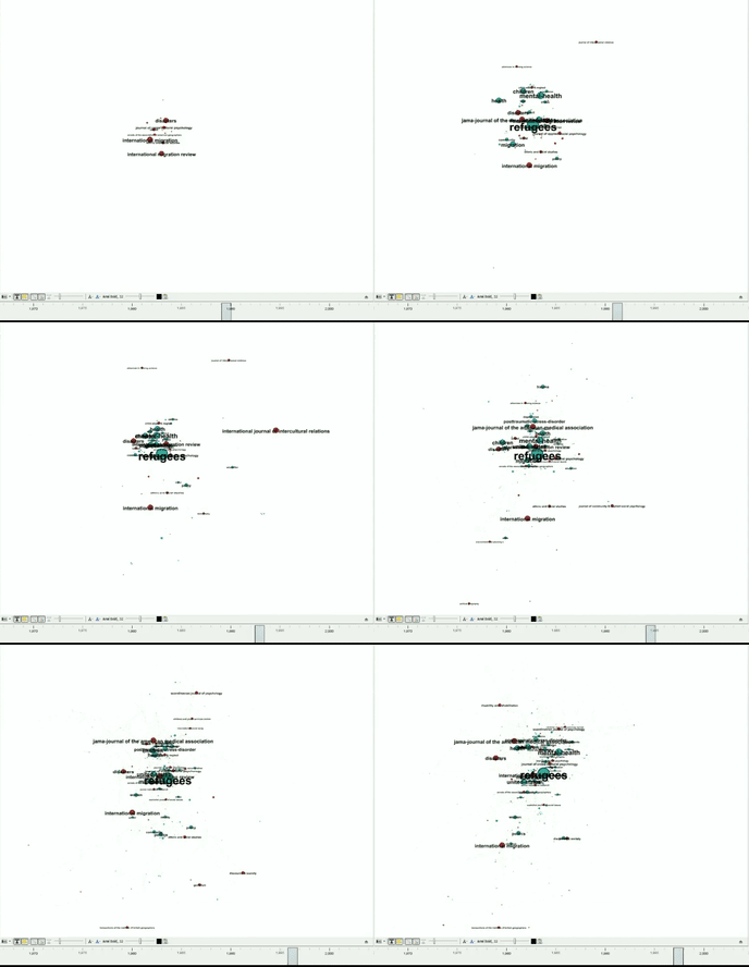
Below is an animation that I was able to do after the workshop, quite impressive, in my view (Note: large file, 25 MiB) 5 minutes. The action starts around the or 1 minute 40 secs into the film:
The animation contains 7634 nodes (in plain text: bubbles: i.e. journal titles and keywords), and 19596 edges ( lines or links between the nodes).
Here:s an animated GIF to give a rudimentary feel of how the full animation will look if you don’t have a large quota:
Tutorial – How-to – Dynamic networks in Gephi
In the following I describe how the animation was created. Note that all cleaning of WoS data was done before starting the procedure and is not part of the tutorial.
Here are the steps to make the dynamic network:
Step 1
Use http://tools.medialab.sciences-po.fr/sciencescape/wok_utils.php
(Web of Knowledge to CSV):
- Upload your WoK file (WoS plain text file)
- Download result (CSV)
Table2Net
Step 2:
http://tools.medialab.sciences-po.fr/table2net/
Create network file from CSV
You can then chose to make a Normal network which will only map data based on one variable (e.g. keywords), but here we chose a bipartite network, which means that we don’t just focus on keywords per se, but also on journal titles, which could be approximated as a world map of science. In the end we get clusters of specific keywords mapped to clusters of journals, which will constitute a dynamic world map of sorts.
Normal network:
Network of tags linked
-
Nodes
-
ID Keywords (plus)
-
Semicolon separated
-
-
Links: Row number
Bipartite network:
-
Network of tags linked to Sources
-
Nodes 1:
-
ID Keywords (plus)
-
-
Semicolon separated
Nodes 2:
-
SO
-
One expression per line
-
Links (none)
-
Additional settings
-
PY
In the Bipartite section, I also added the dynamics of the data, namely by asking the algorithm to add one column pertaning to the years in which each of the journals in the SO-field, and the keywords (plus) in the ID-field were found. Based on this, I was able to create the dynamic map that shows the development of the published literature between 1956 and 2014 regarding refugee studies.
Gephi does not have an export module for video (yet, maybe it will be found in the 0.9.0 release coming December 20th), so instead I made a screencast using Screencast-O-matic that was later saved and trimmed as a five minute video file in the end.
